I just realised that my PlanetJune logo is 10 years old! To celebrate that anniversary I thought I’d give you a peek behind the scenes and show you how I designed my logo.

I’m a complete amateur when it comes to graphic design, so it took many attempts to come up with a good logo. I’ll show you my complete design process from start to finish – even the embarrassing parts.
This is not a professional “how to design a logo” post, but I think it’s fascinating to see how the PJ logo developed, and I hope you will too!
What makes a good logo?
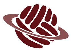
I love my sweet and simple yarn planet – it clearly says ‘PlanetJune’ even without the text, don’t you think? And that’s exactly what a good logo should do.
Think of the Nike swoosh or the McDonald’s golden arches – when you see one of those simple symbols you instantly know exactly what to expect. (That’s a combination of a good logo and a consistent brand identity.)
But the simplest end results can be the hardest to design – if you’re working with clean, simple lines, each line needs to be just right to make the design work. (Hmm, that applies to crochet pattern design too!)
Developing an Idea
I don’t think you can fully appreciate what’s right until you have a wrong to compare it with, so let’s take a look through from my initial design concept for a ‘yarn planet’ to the terrible first prototypes, and then you can see how I gradually edged closer and closer to the logo that has represented me for an entire decade and is still going strong.
But first, here’s 2012-June to tell the story (taken from my blog post where I first launched the logo!)
I started the process in 2009. I read books and articles on good logo design and I knew exactly what I wanted, but I had problems drawing it without adding too much detail.
I’m too stubborn/controlling to ask for outside help: PlanetJune is my baby and it just wouldn’t feel right for the symbol that represents me to be created by somebody else.
Long story short: I drew 2 pages of sketches, made 15 digital prototypes, and now, 3 years later, it’s finally ready.
My Design Iterations
After 10 years, I’m finally brave enough to show you those previously-secret sketches and digital prototypes! Graphic design and digital art are really not my forte, so my first attempts were very… well, let’s just say ‘not good’ 😀
But – and this is important – if you follow through all the steps below you can actually see how each iteration got me closer to ‘good’. Determination and perseverance – that’s the PlanetJune way!
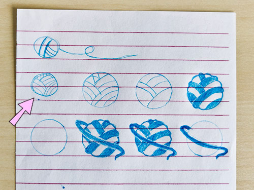
Sketches, round 1: the one with the arrow is the idea I chose as the starting point for my digital design (and the curve of the loose yarn strand at the bottom right was the spark that led to the angled ring around my planet)
Version 1: my first digital attempt at my ‘yarn planet’

Version 2: angled the rings around the planet

Version 3: added bumpy edges to the yarn wraps

Version 4: added a darker shade of yarn, changed text to 2 lines

Version 5: dark rings, light yarn

Version 6: outlined yarn

Version 7: lighter yarn

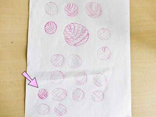
Sketches, round 2: back to the drawing board (literally) to figure out how to simplify the yarn – you can see I came up with the basic concept for my final logo in the one with the arrow!
Version 8: simplified yarn wraps and added yarn strand below text

Version 9: fixed bumpy cutout on ring behind planet

Version 10: simplified ring by removing white band

Version 11: dark yarn

Version 12: pale ring

Version 13: pale yarn strand

Version 14: changed yarn ball to look less like a fist (can you see the 4 fingers in the above versions, or is that just me?)

Final logo: completely redrawn yarn strands to make them more rounded and even.

So there you go! You can see from the early attempts how having a good idea doesn’t necessarily translate into having a good design, but each stage brought me closer and closer to the adorable and completely unique yarn planet that is the representation of PlanetJune.

I hope you’ve enjoyed this little insight into the long process of creating the PlanetJune logo. I’m so grateful to 2009-2012 June for putting all that effort in to create a logo I can still be proud of today, 10 years later!





Jacqueline said
What an interesting story! Such a long process to go through, but well worth it in the end! Especially knowing it’s totally yours! Congratulations on 10 years June!! All your work is beautiful!
Priscilla said
Congratulations June ? 10 years is an amazing milestone to have reached for any brand! I’m sure you have many more creative years ahead.
I agree the earlier designs are more yarn ? like but as you said I’m sure it is harder to create.
Your final design is wonderful! Even though I didn’t specifically see the 4 fingers until you mentioned it, I did see that it was like curled fingers holding the yarn.
Well done on all your milestones ?
Holly said
I love seeing your process and early designs! I actually remember reading the original post in 2012, and now I’m feeling old realizing that was 10 years ago…
June said
I know that feeling all too well, Holly – how can time speed past so quickly?! If I didn’t have this blog as a dated record of everything I’ve been doing, I wouldn’t believe it…
.: petrOlly :. said
Awesome story.
And I didn’t notice the fist until you mentioned it! 😀
I like the version 3 (and/or 5) of the yarn ball but you’re right – in this case less is more.
Real-life story: every time we wanted to do something with our company’s website, the external designers wanted to start with the logo. Because it’s apparently always not right and probably the easiest part for them.
You’re right being the sole queen and mistress of your universe, June! 😉
June said
I discovered that the early versions – anything with thin lines – would suffer when it’s shrunk down small, and the thin lines just disappear. So bold, clear and simple is definitely a better choice for a logo. I’m sure a professional designer would want to tinker with my logo too, but I’m not letting anyone near it – it’s mine 😀
Sandy G said
Great story, June! I’ve certainly been happy to be able to visit your planet all these years!
June said
Thank you, Sandy! It’s so nice to have you following along on my journey ?